 You know this has happened to you, you see a link to something, and you open it, and the screen looks like the image to the left.
You have tons of ads. The article is only 25% or less of the screen. Then you have to close a pop-up subscription box as well as a chat box in the lower right corner asking you to chat with a company you have never heard of before.
Frustrating, isn’t it?
First - If you are guilty of this on your website...STOP!
It turns people off.
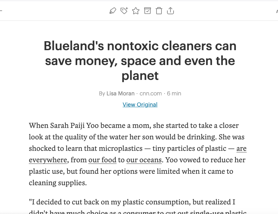
Second - here is what I do when I see something that looks interesting. I send it to Pocket. It’s a free tool that will give you the headline, strip away all of the stuff you don’t want so that it reads like a word document, and will tell you how long it should take you to read it based on word count. It will turn the above image into this:

The best part of this is that it is totally free and ad-free. There is a pro version, but I have yet to need it for purposes like this. I highly recommend this app! You can get the extension in the google store for chrome. It lets you save and send articles to the app with one click.
I often save articles on my computer and then read them on my phone later. In this cleaner format, I find that I read it faster, and I retain more. It’s the same reason I prefer my kindle to a tablet. There are fewer distractions.
Images from Pixabay
Leave a Reply